Frédéric Malle and Patrick Li:
For the Love of Design and Typography
Frédéric Malle
Patrick Li
Frédéric Malle
Patrick Li
Frédéric Malle is an aesthete who admits to an obsession with work well done, showing a sense of detail. It’s not a matter of some vain and idealistic quest for perfection, but of an ambition to bring an idea to fruition in the best possible way. When he has a feeling that something is not quite right, he calls upon those with rare and precious expertise, like Patrick Li.
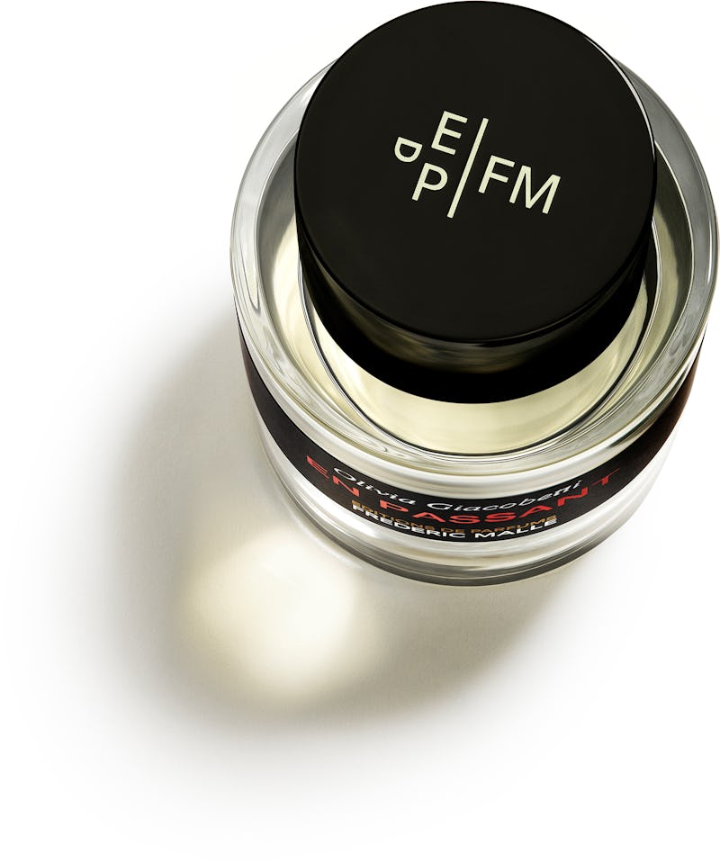
Having worked in advertising in the past, Frédéric Malle has a confirmed taste for typography, and attaches particular importance to it. So when he designed his own logo and his first packaging, he gave pride of place to the lettering, which he emphasized with the sobriety that defines his aesthetic. In a Bauhaus-inspired spirit, the letters EDPFM display their strength through a graphic design that makes them seem well-established.
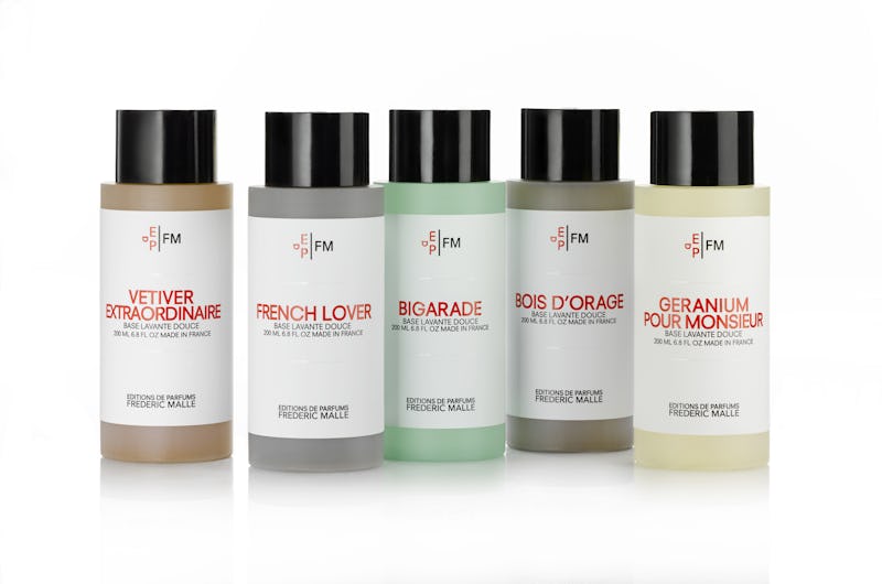
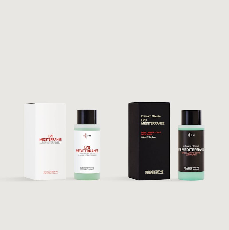
Body wash packaging designed by Li Inc.
When he first created his monogram, Frédéric Malle's ambition was to achieve the level of graphic excellence found in the Yves Saint Laurent logo (designed by Cassandre in 1961) or that of Chanel. As a former advertising executive, he knows the importance of brand value and the symbols of identity that help build it, and there was no question of his being perceived as anything other than a major perfume brand. On the advice of Alexandre de Betak (the artistic director of major fashion shows), Frédéric Malle met with Patrick Li, who had launched his New York art and graphic design studio in 2000. A graduate of the University of California at Berkeley, where he studied architecture, Li’s taste for purity and the Bauhaus immediately seduced Frédéric Malle, who saw in Li his own quest for modernity and the obsession with a well-honed image. So, when looking to perfect his brand identity by enhancing its typography, Malle turned to Li, whom he asked to work on the monogram and to improve the original logo.
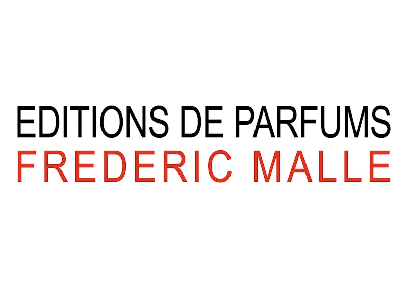
Original logo, designed by Frédéric Malle
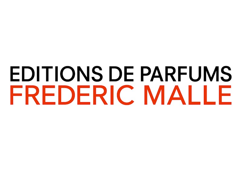
Current logo, designed by Li Inc.
The two men shared a common aesthetic and a common language, which would spell the beginning of a continuous collaboration and a deep complicity. In 2011, Li was entrusted with designing the monogram for Editions de Parfums. The original logo created by Frédéric Malle was overhauled to make it more specific and more harmonious. Li also worked on the packaging for certain products in the body line.
Body line packaging update from 2012 to 2019
Current bottle cap with monogram designed by Li Inc.
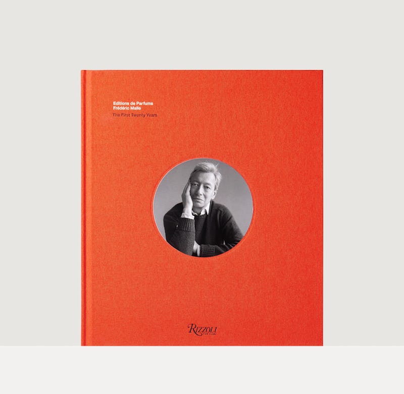
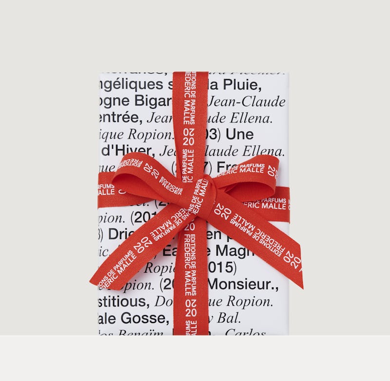
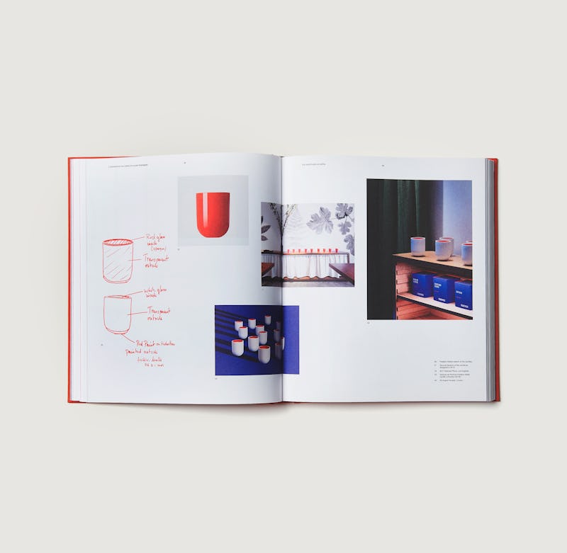
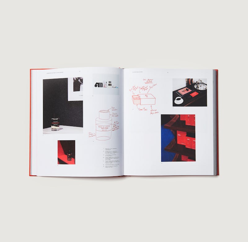
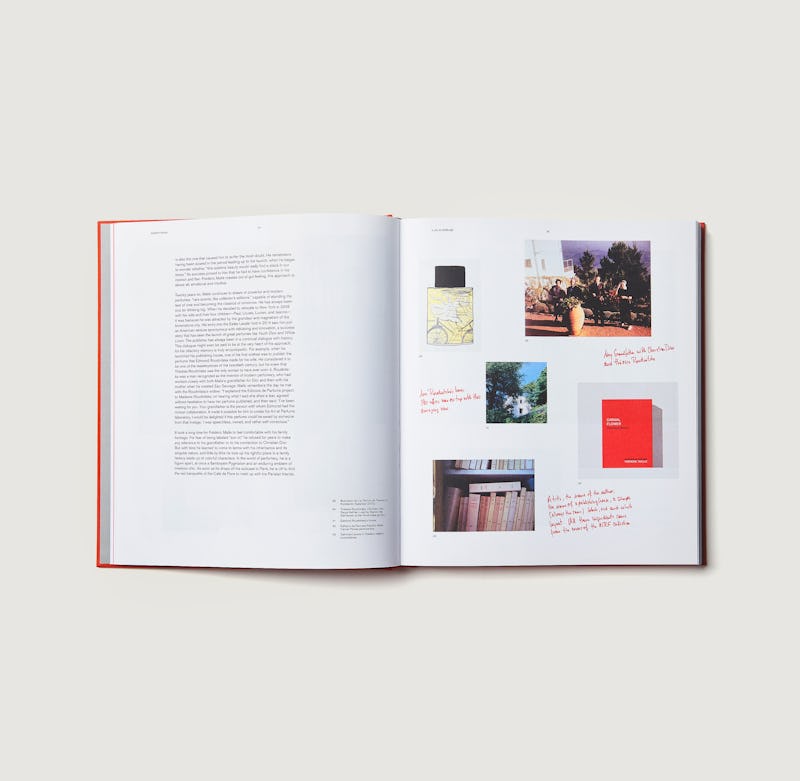
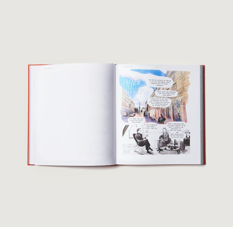
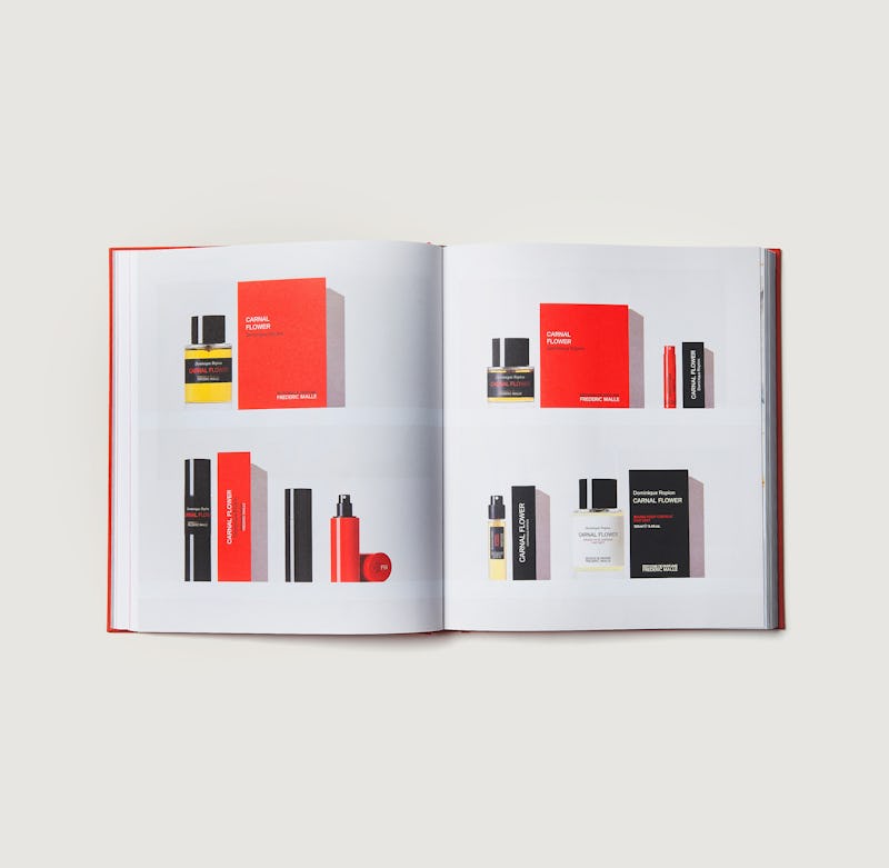
In 2020, for the twentieth anniversary of Editions de Parfums, Li's graphic signature is more visible than ever. Confident that Li knows the history of the brand by heart and understands the fundamentals of its genetic code, Frédéric Malle entrusted him with the artistic direction of the twenty year anniversary: graphic design of the logo and of the packaging for the limited edition perfumes, as well as artistic direction of the book devoted to the first twenty years of Editions de Parfums Frédéric Malle, to be published in October by Rizzoli New York.
Cover of “Editions de Parfums Frédéric Malle: The First Twenty Years”
20 Year Anniversary limited edition wrapping paper
A glimpse into the book
